Logo
Our logo is one of the most powerful expressions of the Lunary Games® identity. Whether it's featured in trailers, packaging, or on merchandise, it must remain clear, consistent, and instantly recognizable.
These guidelines define the correct usage of our logo in various contexts, ensuring that our brand integrity is always preserved — across every platform, medium, and interaction.
Primary Versions
These are the main versions of the Lunary Games® logo. They are to be used across most communications unless otherwise specified. Each logo includes the full wordmark and our signature fox emblem.
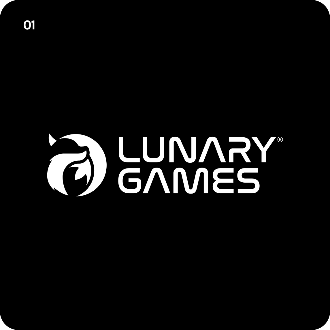
Version 1 — Primary Logo
White background
Black background
Version 2 — Framed Variant
White background
Black background
Construction
The Lunary Games® logo was carefully crafted using a geometric grid system to ensure balance, symmetry, and visual harmony. This construction allows the logo to maintain clarity and elegance at any scale.
The circular forms and curved lines used in the symbol represent fluidity, creativity, and our fox’s agile spirit. Each arc and proportion has been calibrated to work both in digital and print applications.
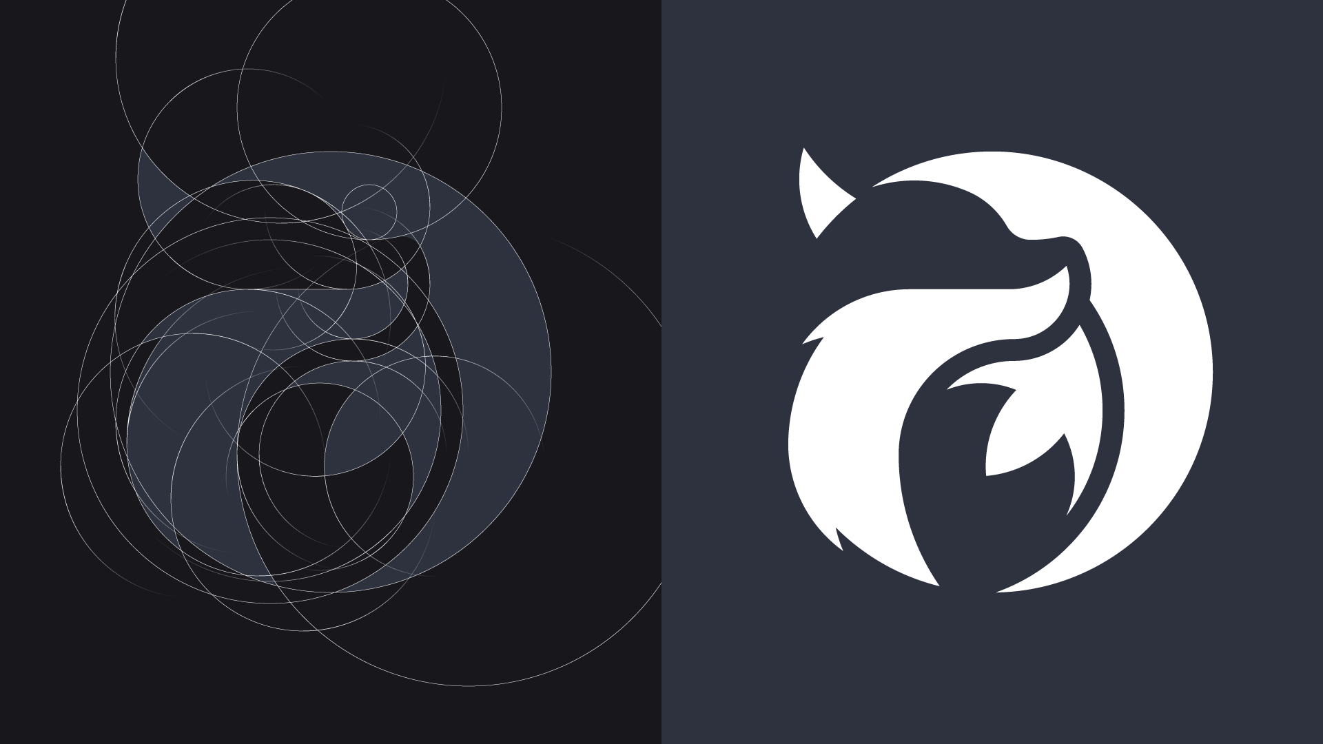
Logo grid showing precise proportions and geometric foundations.
Clearspace
To ensure visibility and impact, our logo must always be surrounded by a minimum amount of clear space. This area isolates the logo from other elements such as text, graphics, or edges of the layout.
The minimum clearspace is defined by the height of the "U" in the Lunary Games® wordmark. No text or other graphic elements should enter this zone.
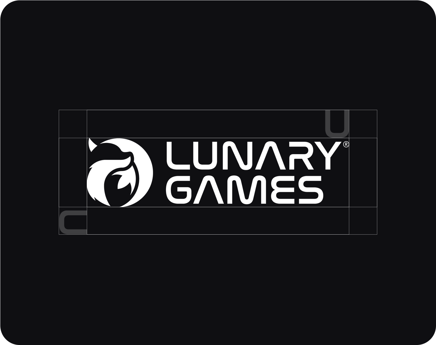
Minimum clearspace defined using the letter “U” as reference.
Scalability
The Lunary Games® logo has been designed to remain legible and iconic at a variety of sizes. From large banners to small digital icons, each element of the logo maintains its integrity and recognition.
To ensure readability and clarity, the minimum recommended height for digital usage is 25px. Below this size, visual details such as the fox silhouette or letterforms may become indistinct or lost.
For smaller applications like favicons, social media icons, or in-game UI, we recommend using the standalone fox symbol whenever space is limited.
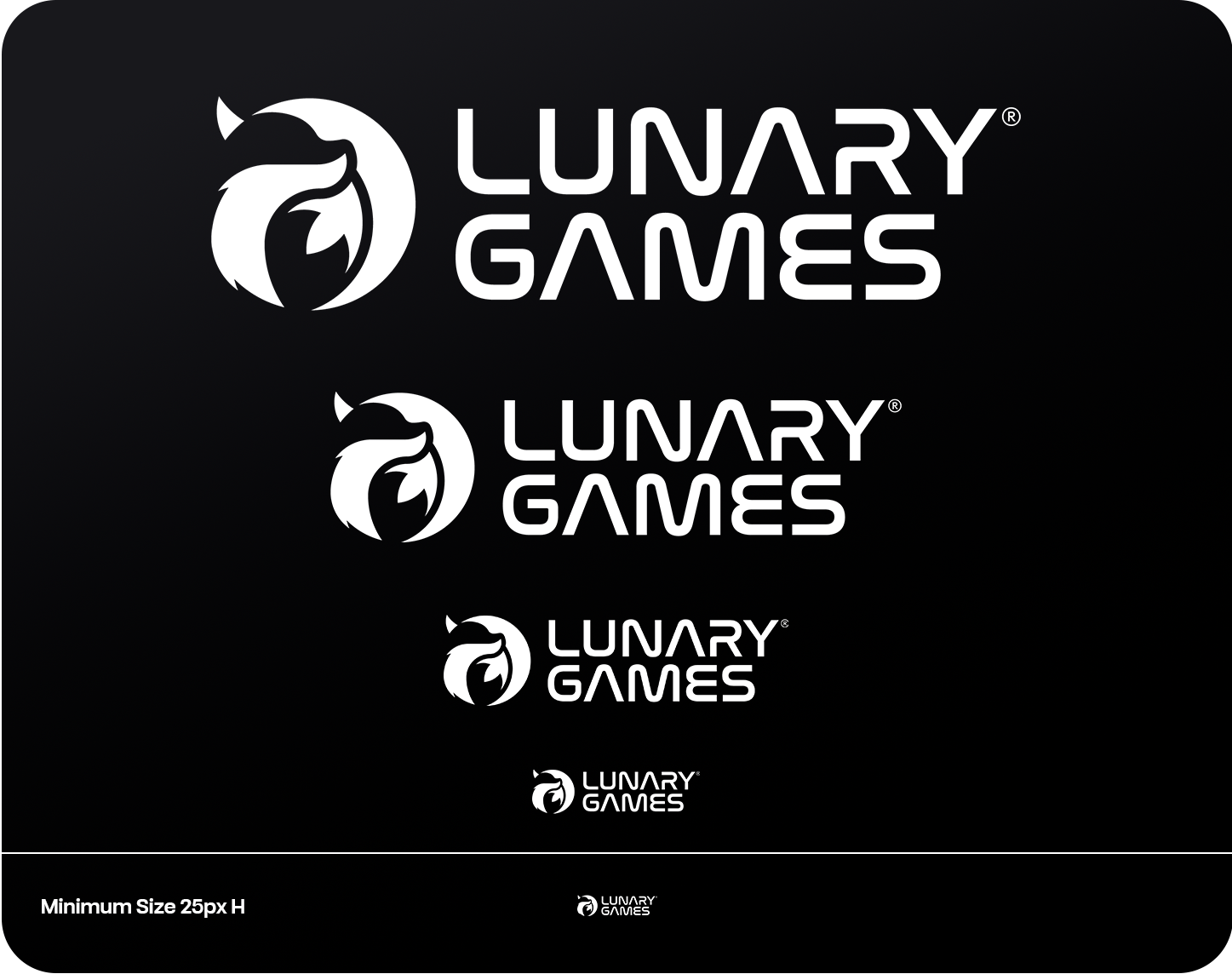
Minimum recommended size for digital use: 25px height.
Placement
The placement of the Lunary Games® logo plays a crucial role in maintaining visual harmony across layouts. It should always be positioned with intention and consistency.
For most designs, the logo should be placed in one of the four corners — typically the top-left or bottom-right — depending on the composition and focal elements.
Always respect clearspace around the logo and avoid placing it too close to edges, complex backgrounds, or other graphic elements. Placement should feel deliberate, balanced, and not intrusive.
Suggested corner placements for digital and print use.
Color
The Lunary Games® logo is designed to adapt across a range of color palettes while maintaining its visual integrity and emotional impact.
The most commonly used and recommended versions are Color 1, Color 2, Color 4 Fade, and Color 5 Fade. These ensure maximum consistency across products, platforms, and environments.
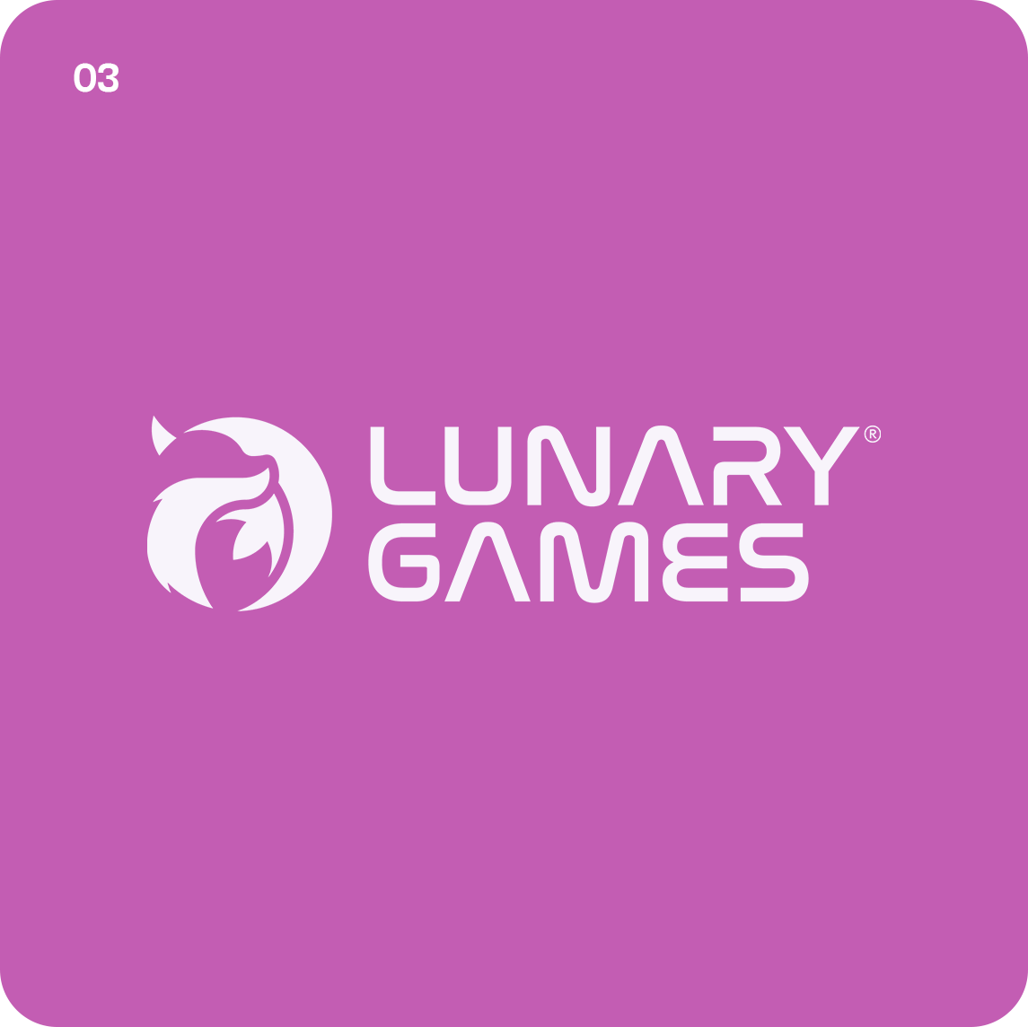
Color 3 and Color 6 are stylistic variants used in special themes or merchandise collections. This flexibility allows the Lunary Games® logo to express itself emotionally while adapting to the tone of each campaign or product line.
Color 1 — Primary (White on Black)
Color 2 — Primary Inverted (Black on White)
Color 4 Fade — Soft Violet Gradient
Color 5 Fade — Midnight Violet Gradient
Color 3 — Magenta Variant
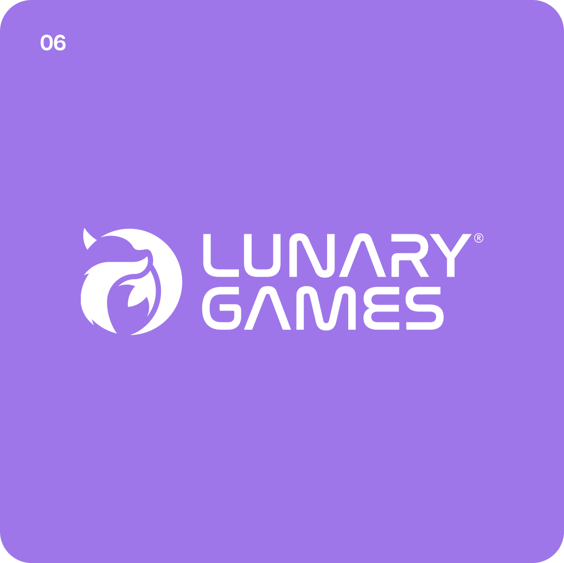
Color 6 — Pastel Violet Variant
Do’s & Don’ts
When placing the Lunary Games® logo over photography, illustrations, or textures, it’s essential to ensure its clarity and emotional resonance. Our brand thrives on dreamlike atmospheres, but never at the expense of readability.
Ensure there is sufficient contrast between the logo and the background. Images that are too bright, cluttered, or lack clear focal areas may cause the logo to fade into the composition.
A general rule: maintain a minimum contrast ratio of 4.5:1 between the logo and its background, following WCAG accessibility standards.
Favor clean, minimal backgrounds that give the logo room to breathe. Avoid placing it over central content or visual noise. The Lunary Games® identity is elegant and focused, let it speak clearly.
Contrast Checker
To test contrast between your background and the Lunary Games® logo, we recommend using this modern and easy-to-use tool:
With it, you can:
- Check contrast ratios between two HEX colors.
- Preview how your colors appear for different visual impairments.
- Adjust hues in real-time to meet accessibility (AA/AAA) standards.
Maintaining proper contrast not only ensures accessibility, but also upholds the integrity and impact of the Lunary Games® brand in any environment.
Examples
✅ Yes: Logo has enough contrast with the background.
✅ Yes: Logo has enough contrast with the background.
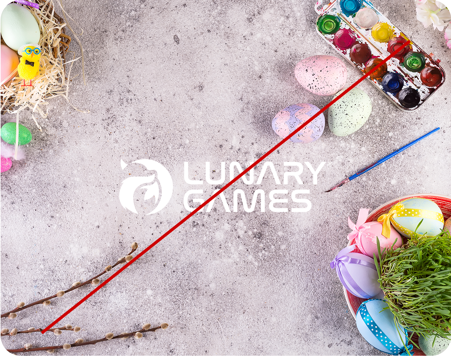
❌ No: Not enough contrast between the logo and the imagery.
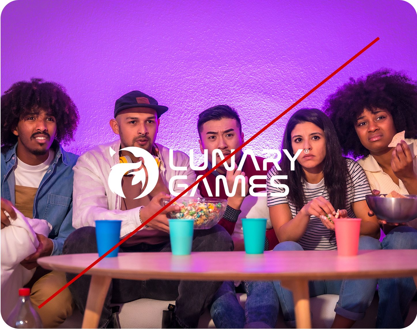
❌ No: Logo placement interferes with busy background.
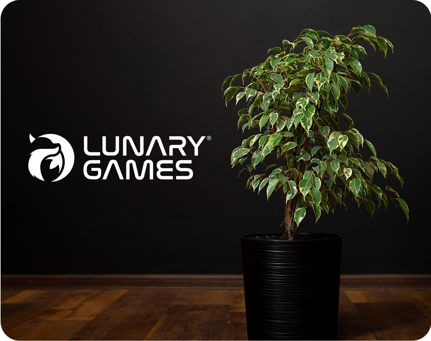
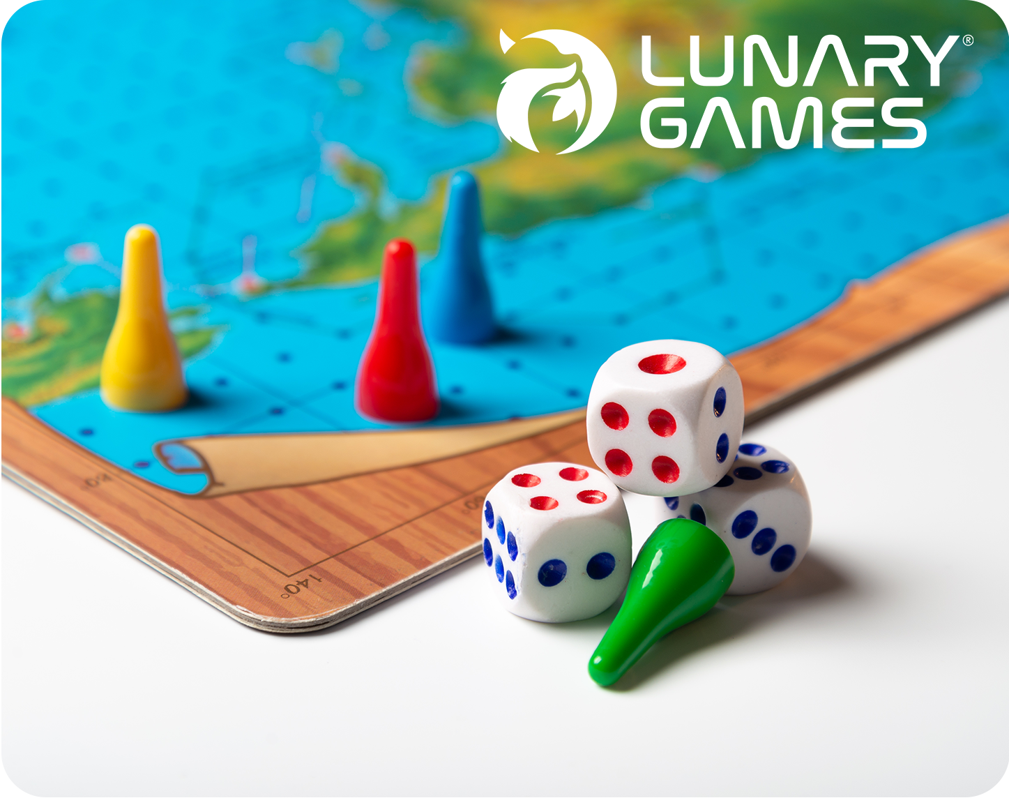
Contextual Usage
The presence of the Lunary Games® logo must always be intentional and enhance the visual composition without creating confusion or redundancy. Its application depends on the communication context — whether the logo is already present in the layout (e.g. via avatar or packaging) or not.
In social media posts, if the brand is already identifiable through avatars, product packaging, or context (like a recognizable box design), it’s often best to let the product speak for itself. Adding the logo again in these cases can clutter the design and reduce impact.
Conversely, when the brand isn’t visually obvious — such as in standalone visuals or atmospheric shots — the logo should be used as a clear brand anchor. Consistency is key, but elegance and restraint are equally important in brand storytelling.
Examples
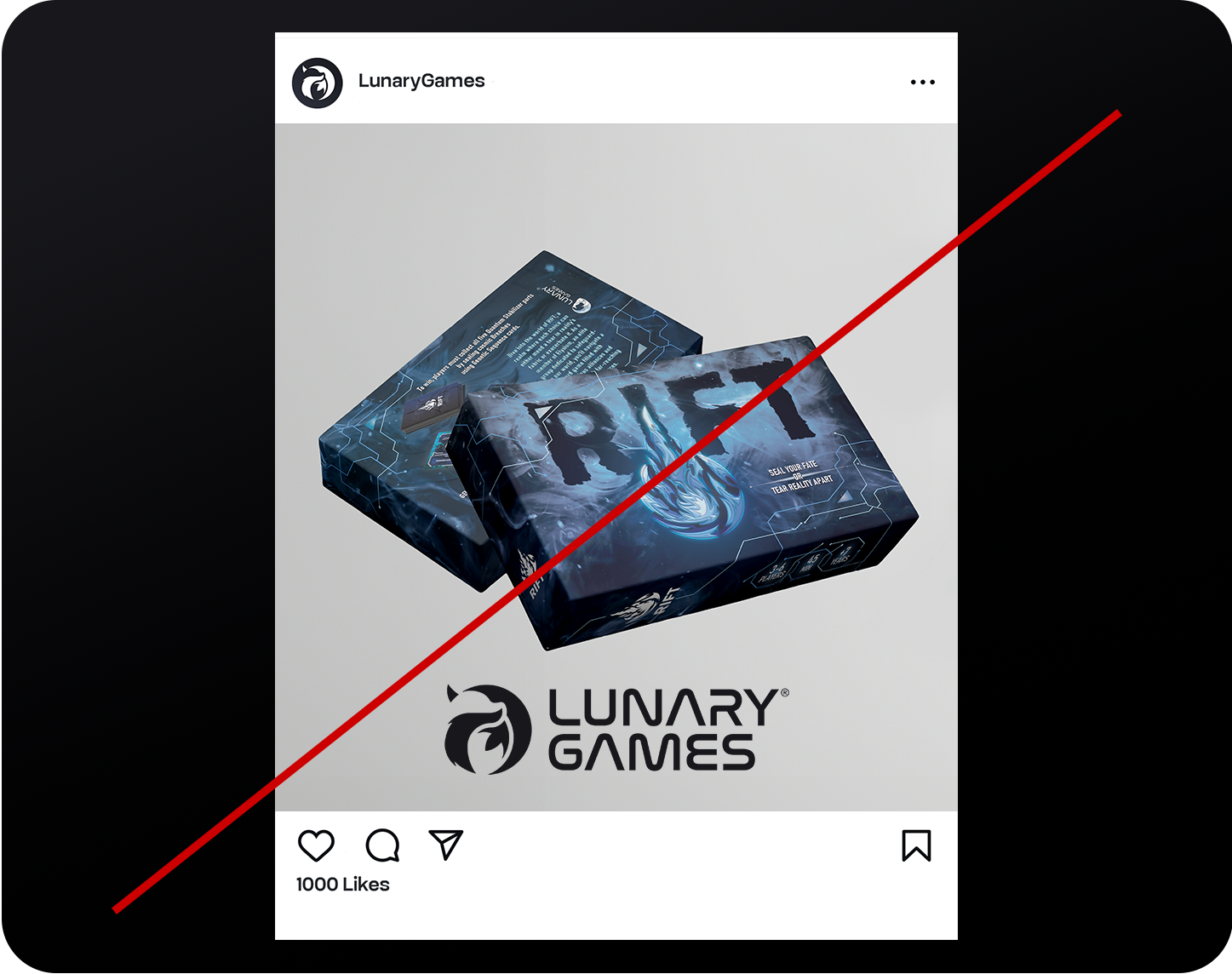
❌ No: Logo is redundant, it’s already visible on the box and the account name.
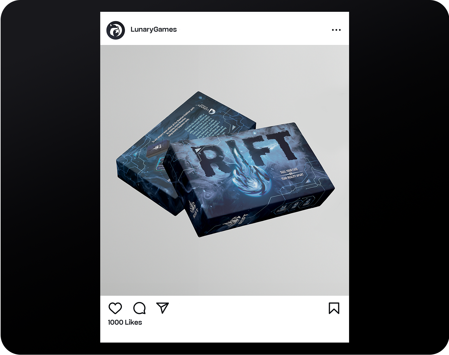
✅ Yes: Clean, elegant composition, the packaging and context carry the branding.
Partner Lockup
Lunary Games® frequently collaborates with partners, publishers, and event organizers. To ensure visual consistency, we’ve defined precise guidelines for logo lockups with our collaborators.
Partner Lockup — Horizontal
In the horizontal configuration, the Lunary Games® logo appears on the left, followed by a vertical divider line (1mm thick), then the partner logo. The spacing between the logos should equal 1.5× the height of the fox icon (denoted as X).
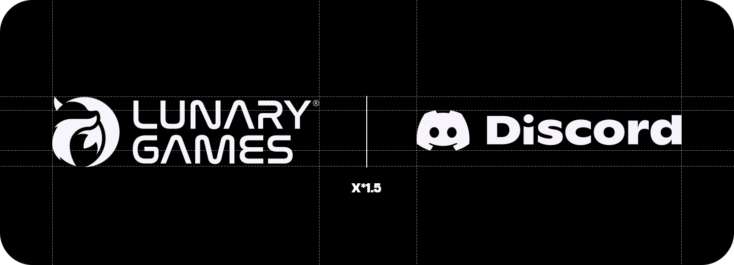
Grid construction — spacing is based on X × 1.5.
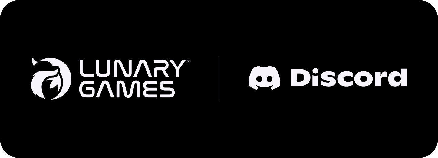
Final visual used for official partnerships.
Partner Lockup — Vertical
In the vertical configuration, the Lunary Games® logo is positioned above the partner logo. A horizontal divider line (1mm thick) separates the two. The spacing between the logos should be exactly 1× the height of the fox icon (X).
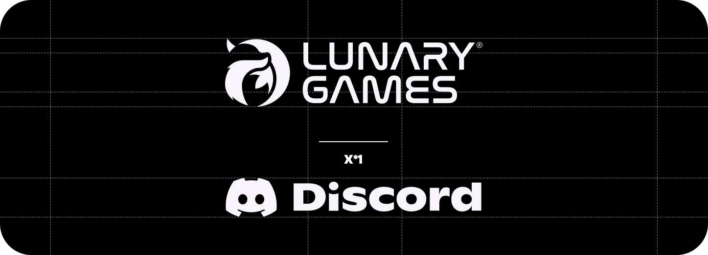
Grid layout — spacing is based on X × 1.

Final vertical layout for campaigns and signage.
Partner Lockup — Optical Adjustment
Not all logos carry the same visual weight. This is why logos in a lockup must be optically adjusted to appear visually balanced, even if their technical dimensions are different.
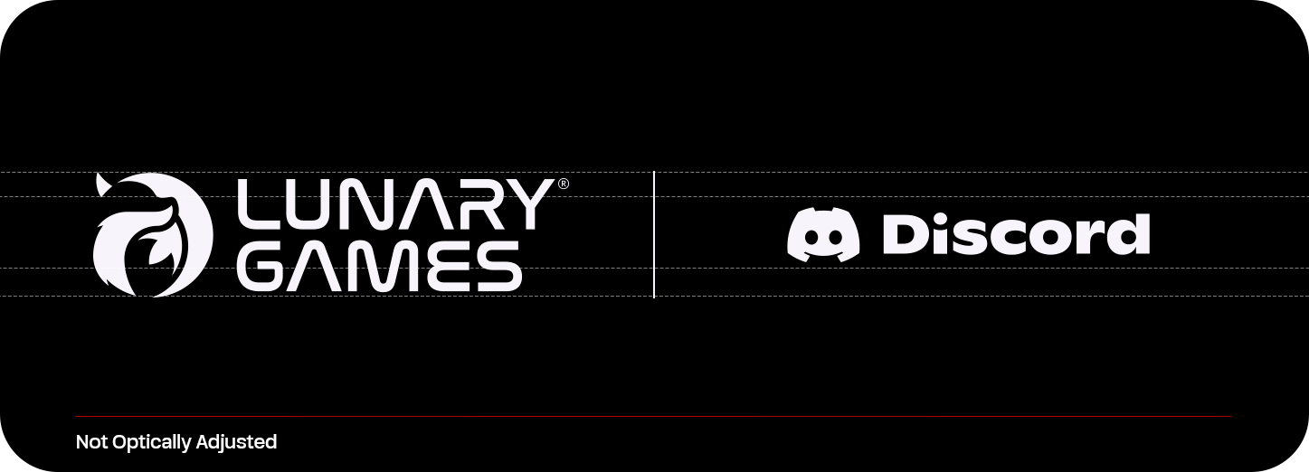
❌ Not adjusted: Discord appears heavier than Lunary Games®.
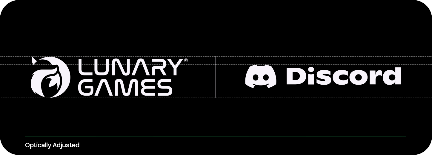
✅ Adjusted: Both logos appear balanced and harmonious.
All official lockups are provided by the Lunary Games® design team. Do not create your own versions, please reach out to receive the approved files.
Logo Don’ts
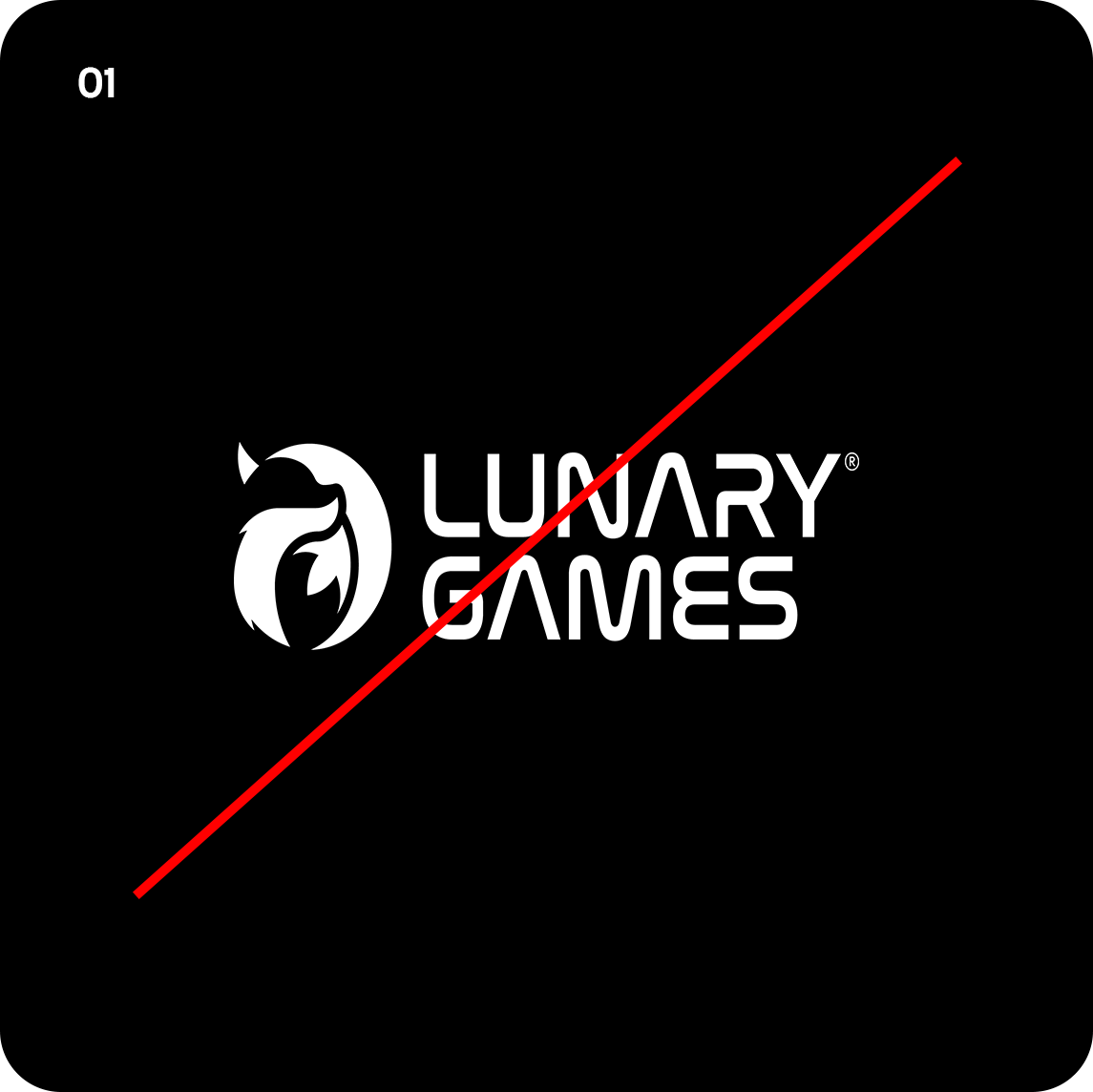
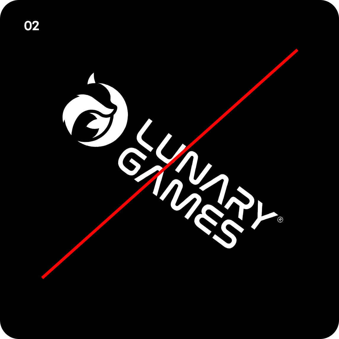
To maintain a consistent, professional, and impactful brand presence, the Lunary Games® logo must never be altered or manipulated. Below are examples of what not to do.
❌ Don’t stretch or distort the logo
❌ Don’t rotate the logo
❌ Don’t change alignment of the logo
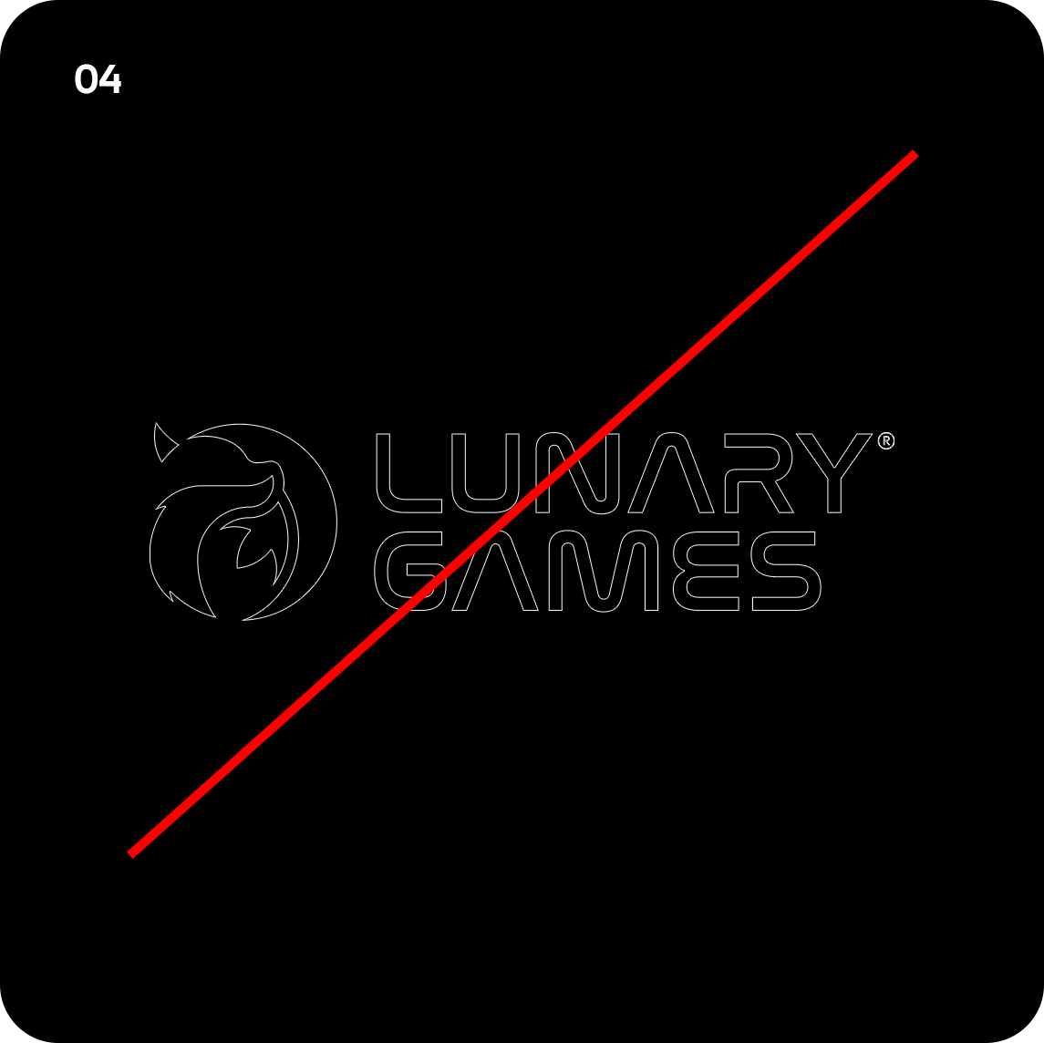
❌ Don’t outline the logo
❌ Don’t change scale between symbol and wordmark
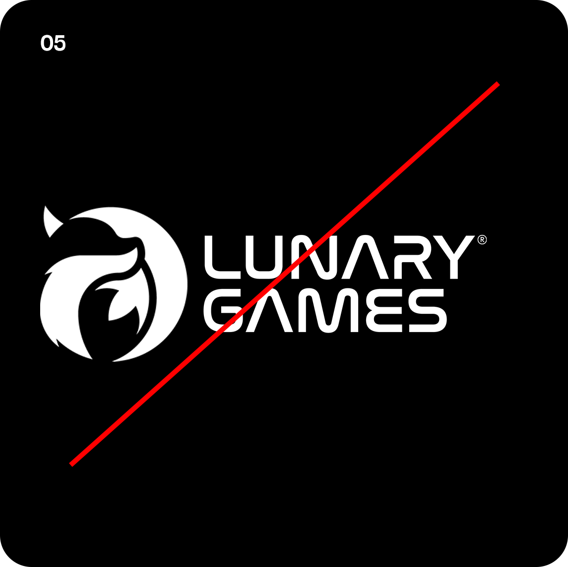
❌ Don’t use the logo as a mask or image fill

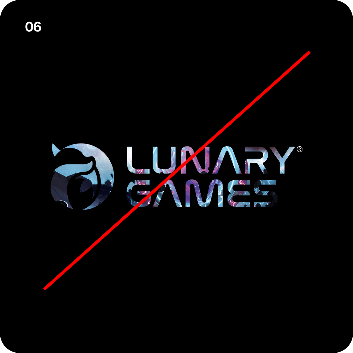
❌ Don’t apply effects like glows, shadows or bevels
❌ Don’t use unapproved color combinations
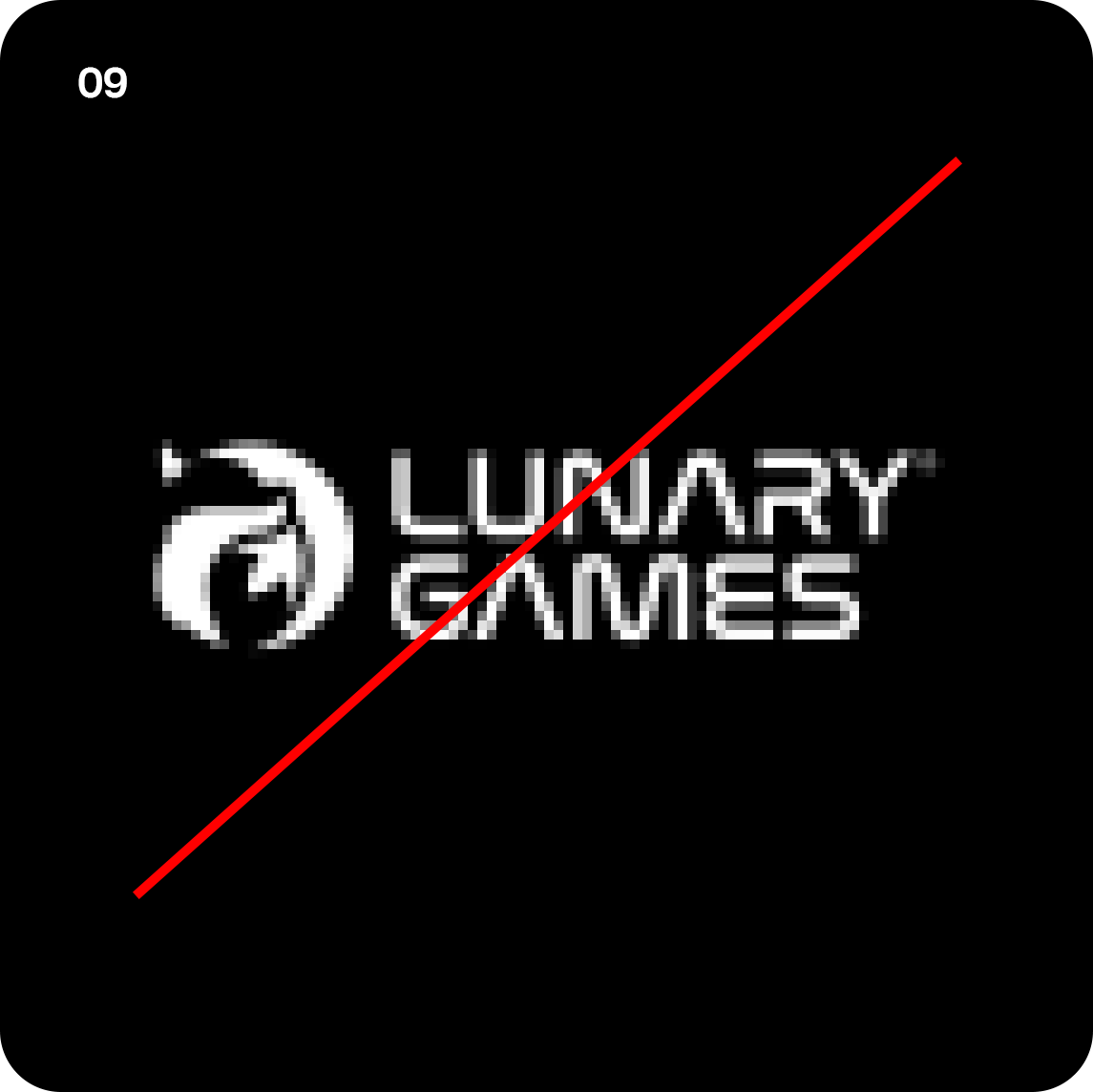
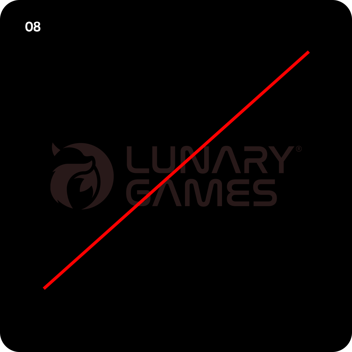
❌ Don’t use low-resolution or pixelated logos
The Lunary Games® logo is a core visual asset treat it with care and consistency to ensure its power and recognition remain intact.